As a marketing and print services company, we have long known that color plays a major role in the success of any marketing campaign. Specific colors tend to evoke certain emotions in customers, thus creating brand relevance and motivating purchases. The following lists 10 colors that increase sales, along with the specific emotions they bring forth.
1. Orange
Orange is high energy. It has powerful attention-getting properties, it’s fun and cool, and it makes customers feel as though they’re dealing with a cutting-edge company. Cheerful orange evokes exuberance, fun and vitality. With the drama of red plus the cheer of yellow, orange is viewed as gregarious and often childlike. Research indicates its lighter shades appeal to an upscale market. Peach tones work well with health care, restaurants and beauty salons.
2. Blue
When you want your brand to be viewed as trustworthy and cool, blue is the color for you. Mix blue with complimentary colors for best results. Cool blue is perceived as trustworthy, dependable, fiscally responsible and secure. Strongly associated with the sky and sea, blue is serene and universally well-liked. Blue is an especially popular color with financial institutions, as its message of stability inspires trust.

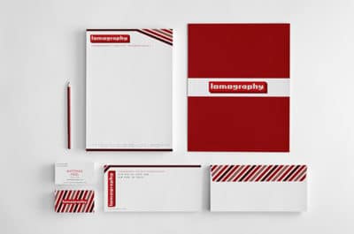
3. Red
Red is the color of power. It means business. It gets people’s attention and it holds it, which is why it’s the most popular color for marketing. Red activates your pituitary gland, increasing your heart rate and causing you to breathe more rapidly. This visceral response makes red aggressive, energetic, provocative and attention-grabbing. Count on red to evoke a passionate response, albeit not always a favorable one. For example, red can represent danger or indebtedness.
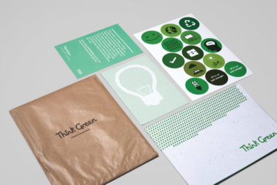
4. Green
Green is a versatile color. It is warm and inviting, lending customers a pleasant and open feeling. In general, green connotes health, freshness, environment and serenity. However, green’s meaning varies with its many shades. Deeper greens are associated with wealth or prestige, while light greens are calming.
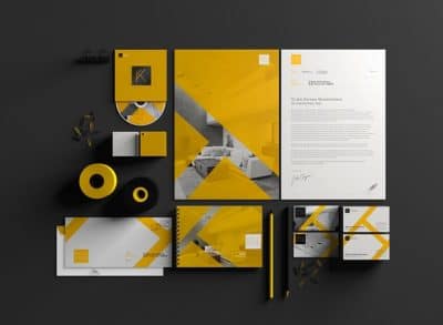
5. Yellow
Yellow is a powerful color, but it is also the most dangerous hue. Use yellow to command your audience’s attention, and let them know you’re confident in your abilities. In every society, yellow is associated with the sun. Thus, it communicates optimism, positivism, light and warmth. Certain shades seem to motivate and stimulate creative thought and energy. The eye sees bright yellows before any other color, making them great for point-of-purchase displays.
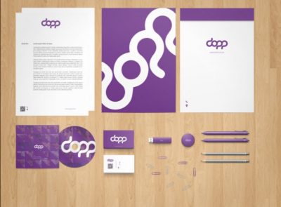
6. Purple
Purple is the color of royalty, which makes it perfect for lending a touch of elegance and prestige to your marketing materials. Purple is a color favored by creative types. With its blend of passionate red and tranquil blue, it evokes mystery, sophistication, spirituality and royalty. Lavender evokes nostalgia and sentimentality.
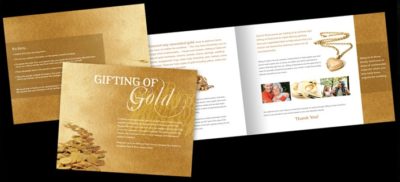
7. Gold
Gold is likewise elegant and prestigious, but adds an element of power purple can’t match. In combination with purple or green, gold is a powerful color that symbolizes wealth and pedigree.
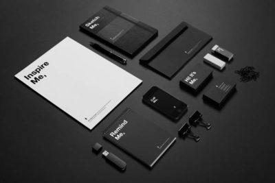
8. Black
Black is another highly versatile color. It can be modern or traditional, exciting or relaxing. Used as a contrasting color, black most often adds drama to whatever mood you want to cast. Black is serious, bold, powerful and classic. It creates drama and connotes sophistication. Black works well for expensive products, but can also make a product look heavy.
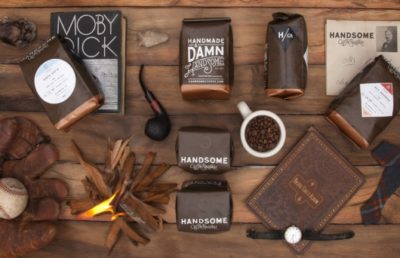
9. Brown
Brown, an earthy tone, is known as a comfort color, lending relaxation to customers. This earthy color conveys simplicity, durability and stability. It can also elicit a negative response from consumers who relate to it as dirty. Certain shades of brown, like terracotta, can convey an upscale look. From a functional perspective, brown tends to hide dirt, making it a logical choice for some trucking and industrial companies. Think UPS.
10. Pink
Vying for the attention of a young female demographic? You can’t go wrong with pink. It’s fun, frilly and totally female. Pink’s message varies by intensity. Hot pinks convey energy, youthfulness, fun and excitement and are recommended for less expensive or trendy products for women or girls. Dusty pinks appear sentimental. Lighter pinks are more romantic.