This is a guest Post from our friends at High-Proof Creative
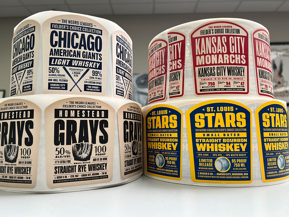
You know the saying “measure twice, cut once”? That sentiment pertains to labels and printing, as well.
When working on a label for an alcohol brand, it’s crucial to ensure that it complies with TTB (Alcohol and Tobacco Tax and Trade Bureau) guidelines while also meeting your brand’s aesthetic and overall marketing goals.
To make sure you don’t find yourself with a pile of useless labels because they were close, but one very important detail was missing, here’s a list of questions to ask your designer before going to print:
“Does the label possess the required TTB guidelines for alcohol labels, have you included the mandatory elements and is it the correct dimensions?”
When it comes to alcohol labeling, precision is paramount. You don’t want to gamble on whether your label meets the stringent requirements set forth by the Alcohol and Tobacco Tax and Trade Bureau (TTB). Ensuring that your label designer has meticulously incorporated all necessary TTB guidelines into your label design is not just a good idea – it’s essential.
Picture this: your finely crafted spirit is ready to hit the shelves, but wait – is the label compliant? Don’t leave it to chance. By asking your designer if the label dimensions are correct and if the TTB guidelines are seamlessly integrated into the design and dimensions of the label, you’re taking a proactive step towards regulatory compliance and consumer safety.
So, what exactly does this entail? It means double-checking that your label includes all mandatory elements required by the TTB. This includes vital information such as alcohol content and government warning statements. But it doesn’t stop there. Depending on the type of spirit you’re producing, there may be additional guidelines specific to your product that need to be addressed.
Think of it as ensuring that every piece of the puzzle fits snugly into place. From font sizes to placement, every detail matters. After all, your label isn’t just a piece of paper – it’s the face of your brand. It’s the first impression you make on consumers as they browse the shelves.
By asking the right questions and confirming that your label meets the TTB guidelines, you’re not only safeguarding against potential regulatory issues but also demonstrating your commitment to transparency and quality. So, before you send your design off to the printers, take a moment to ask: Are we compliant? Are we accurate? Your label – and your brand – will thank you for it.
“What kind of finishes and techniques can be used for my label?”
Specifying special finishes and printing techniques for your label design isn’t just about adding a touch of flair – it’s about elevating your brand and captivating consumers from the moment they lay eyes on your product. So, what exactly are these special finishes and techniques, and how can they transform your label into a work of art?
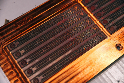
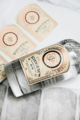
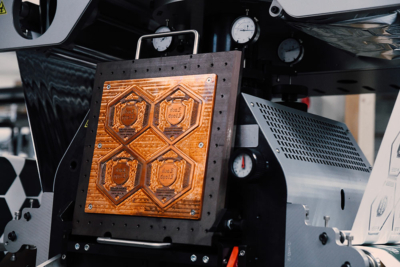
There are various finishes that can be included in your design, from embossing and debossing to hot foil stamping, varnish and screenprinting. Each of these techniques create a tactile experience that beckons consumers to reach out and touch your label.
Embossing raises certain elements of your design, adding depth and dimension, while debossing depresses elements into the label, creating a subtle yet sophisticated effect. Imagine the elegant contours of your brand logo or the intricate details of a decorative motif coming to life with a simple touch.
Whereas, hot foil stamping uses heat and pressure to apply a thin layer of metallic foil to specific areas of your label, creating a luminous sheen that catches the light and commands attention. Whether it’s a shimmering gold accent or a sleek silver flourish, hot foil stamping adds an element of luxury and prestige to your packaging that is sure to leave a lasting impression.
Metallic not really your thing? Enter spot varnish. This technique involves applying a glossy or matte coating to select areas of your label, creating contrast and emphasis that draws the eye exactly where you want it. The contrast between a velvety smooth background and a glossy, raised logo –just a visual feast that demands to be noticed.
Another option is to have a screen printed label. That’s right, it’s not just a technique for tee shirts. This versatile technique allows for vibrant colors and intricate designs to be printed directly onto your label, ensuring crisp, detailed reproduction that showcases your brand in the best possible light while adding a bit of texture and dimension. From bold graphics to delicate patterns, screen printing offers endless possibilities for creative expression.
By specifying these special finishes and printing techniques, you’re not just printing a label – you’re crafting a masterpiece that reflects the essence of your brand and delights the senses of your customers. So, go ahead – embrace the artistry of embellishment and watch as your label becomes a work of art that leaves a lasting impression.
“Will I be able to use this label design on future projects and additional expressions within my portfolio?”
Considering the versatility and scalability of your label design is crucial for future projects and expanding your brand portfolio. While it might be tempting to focus solely on the current product at hand, thinking ahead can save you time, money, and headaches down the line.
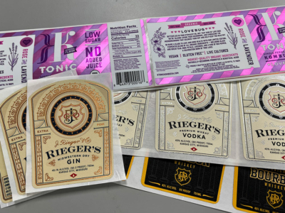
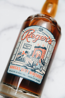
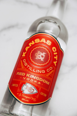
Imagine this scenario: you’ve just crafted a stunning label for your new vodka brand, complete with intricate embossing and elegant embellishments. It’s a *hand kiss in the air* masterpiece that perfectly captures the essence of your brand. But what about your future endeavors? Will this label design be adaptable for other expressions within your portfolio?
This is where foresight becomes invaluable. By discussing with your designer the potential for reusing elements of the label design for future projects, you can ensure continuity and consistency across your brand portfolio. For example, if you plan to introduce a new gin variant down the line, you’ll want to avoid elements on the label that are specific to vodka, such as embossing the word “VODKA”.
Editing or reprinting labels to accommodate changes in product names or variants can be costly and time-consuming. By anticipating these future needs and designing with flexibility in mind, you can streamline the process and minimize unnecessary expenses. This might involve opting for more generic embellishments or choosing design elements that can easily be modified or adapted for different products.
Additionally, maintaining a cohesive brand identity across your portfolio is essential for brand recognition and consumer loyalty. Consistency in design elements such as color schemes, typography, and imagery helps reinforce your brand’s identity and strengthens its presence in the market.
So, when discussing your label design with your designer, be sure to inquire about its scalability and adaptability for future projects. By planning ahead and designing with flexibility in mind, you can set your brand up for success and ensure that your label designs stand the test of time.
Asking your designer questions before sending your label design to print is not just a prudent step – it’s a strategic investment in the success and longevity of your brand. By clarifying details such as compliance with regulatory guidelines, suitability for future projects, and technical specifications, you ensure that your label design not only meets your current needs but also aligns with your long-term vision.
Effective communication with your designer fosters collaboration, mitigates risks, and ultimately results in a label that not only looks stunning on the shelf but also reflects the essence of your brand and resonates with consumers. So, before you give the green light to print, take the time to ask the right questions. Your label, your brand, and your wallet – will thank you for it.
About High-Proof Creative
High-Proof Creative is a digital marketing & branding agency with a passion for craft beverages. The award-winning, woman-led agency provides services for companies internationally in a variety of areas including branding & packaging, website development, design, marketing strategy, social media, content, SEO, and more. Additionally, High-Proof Creative has launched Women in Distilling and Small-Batch Maps.