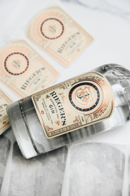
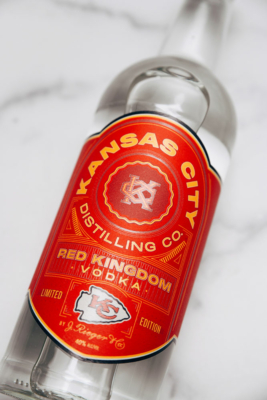
This is a guest Post from our friends at High-Proof Creative

Insight from High-Proof Creative: Questions to Ask Before Printing Your LabelsYou know the saying “measure twice, cut once”? That sentiment pertains to labels and printing, as well.

When working on a label for an alcohol brand, it’s crucial to ensure that it complies with TTB (Alcohol and Tobacco Tax and Trade Bureau) guidelines while also meeting your brand’s aesthetic and overall marketing goals.

To make sure you don’t find yourself with a pile of useless labels because they were close, but one very important detail was missing, here’s a list of questions to ask your designer before going to print:

“Does the label possess the required TTB guidelines for alcohol labels, have you included the mandatory elements and is it the correct dimensions?”

When it comes to alcohol labeling, precision is paramount. You don’t want to gamble on whether your label meets the stringent requirements set forth by the Alcohol and Tobacco Tax and Trade Bureau (TTB). Ensuring that your label designer has meticulously incorporated all necessary TTB guidelines into your label design is not just a good idea – it’s essential.

Picture this: your finely crafted spirit is ready to hit the shelves, but wait – is the label compliant? Don’t leave it to chance. By asking your designer if the label dimensions are correct and if the TTB guidelines are seamlessly integrated into the design and dimensions of the label, you’re taking a proactive step towards regulatory compliance and consumer safety.

So, what exactly does this entail? It means double-checking that your label includes all mandatory elements required by the TTB. This includes vital information such as alcohol content and government warning statements. But it doesn’t stop there. Depending on the type of spirit you’re producing, there may be additional guidelines specific to your product that need to be addressed.

Think of it as ensuring that every piece of the puzzle fits snugly into place. From font sizes to placement, every detail matters. After all, your label isn’t just a piece of paper – it’s the face of your brand. It’s the first impression you make on consumers as they browse the shelves.

By asking the right questions and confirming that your label meets the TTB guidelines, you’re not only safeguarding against potential regulatory issues but also demonstrating your commitment to transparency and quality. So, before you send your design off to the printers, take a moment to ask: Are we compliant? Are we accurate? Your label – and your brand – will thank you for it.

“What kind of finishes and techniques can be used for my label?”

Specifying special finishes and printing techniques for your label design isn’t just about adding a touch of flair – it’s about elevating your brand and captivating consumers from the moment they lay eyes on your product. So, what exactly are these special finishes and techniques, and how can they transform your label into a work of art?

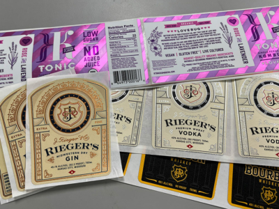
There are various finishes that can be included in your design, from embossing and debossing to hot foil stamping, varnish and screenprinting. Each of these techniques create a tactile experience that beckons consumers to reach out and touch your label.

Embossing raises certain elements of your design, adding depth and dimension, while debossing depresses elements into the label, creating a subtle yet sophisticated effect. Imagine the elegant contours of your brand logo or the intricate details of a decorative motif coming to life with a simple touch.

Whereas, hot foil stamping uses heat and pressure to apply a thin layer of metallic foil to specific areas of your label, creating a luminous sheen that catches the light and commands attention. Whether it’s a shimmering gold accent or a sleek silver flourish, hot foil stamping adds an element of luxury and prestige to your packaging that is sure to leave a lasting impression.

Metallic not really your thing? Enter spot varnish. This technique involves applying a glossy or matte coating to select areas of your label, creating contrast and emphasis that draws the eye exactly where you want it. The contrast between a velvety smooth background and a glossy, raised logo –just a visual feast that demands to be noticed.

Another option is to have a screen printed label. That’s right, it’s not just a technique for tee shirts. This versatile technique allows for vibrant colors and intricate designs to be printed directly onto your label, ensuring crisp, detailed reproduction that showcases your brand in the best possible light while adding a bit of texture and dimension. From bold graphics to delicate patterns, screen printing offers endless possibilities for creative expression.

By specifying these special finishes and printing techniques, you’re not just printing a label – you’re crafting a masterpiece that reflects the essence of your brand and delights the senses of your customers. So, go ahead – embrace the artistry of embellishment and watch as your label becomes a work of art that leaves a lasting impression.

“Will I be able to use this label design on future projects and additional expressions within my portfolio?”

Considering the versatility and scalability of your label design is crucial for future projects and expanding your brand portfolio. While it might be tempting to focus solely on the current product at hand, thinking ahead can save you time, money, and headaches down the line.

Imagine this scenario: you’ve just crafted a stunning label for your new vodka brand, complete with intricate embossing and elegant embellishments. It’s a *hand kiss in the air* masterpiece that perfectly captures the essence of your brand. But what about your future endeavors? Will this label design be adaptable for other expressions within your portfolio?

This is where foresight becomes invaluable. By discussing with your designer the potential for reusing elements of the label design for future projects, you can ensure continuity and consistency across your brand portfolio. For example, if you plan to introduce a new gin variant down the line, you’ll want to avoid elements on the label that are specific to vodka, such as embossing the word “VODKA”.

Editing or reprinting labels to accommodate changes in product names or variants can be costly and time-consuming. By anticipating these future needs and designing with flexibility in mind, you can streamline the process and minimize unnecessary expenses. This might involve opting for more generic embellishments or choosing design elements that can easily be modified or adapted for different products.

Additionally, maintaining a cohesive brand identity across your portfolio is essential for brand recognition and consumer loyalty. Consistency in design elements such as color schemes, typography, and imagery helps reinforce your brand’s identity and strengthens its presence in the market.

So, when discussing your label design with your designer, be sure to inquire about its scalability and adaptability for future projects. By planning ahead and designing with flexibility in mind, you can set your brand up for success and ensure that your label designs stand the test of time.

Asking your designer questions before sending your label design to print is not just a prudent step – it’s a strategic investment in the success and longevity of your brand. By clarifying details such as compliance with regulatory guidelines, suitability for future projects, and technical specifications, you ensure that your label design not only meets your current needs but also aligns with your long-term vision.

Effective communication with your designer fosters collaboration, mitigates risks, and ultimately results in a label that not only looks stunning on the shelf but also reflects the essence of your brand and resonates with consumers. So, before you give the green light to print, take the time to ask the right questions. Your label,  your brand, and your wallet – will thank you for it.

About High-Proof Creative

High-Proof Creative is a digital marketing & branding agency with a passion for craft beverages. The award-winning, woman-led agency provides services for companies internationally in a variety of areas including branding & packaging, website development, design, marketing strategy, social media, content, SEO, and more. Additionally, High-Proof Creative has launched Women in Distilling and Small-Batch Maps.

By Kat McDaniel, Principal at MEDiAHEAD

Brands that use labeling are going through some big changes this year to gain market share.

They’re not just thinking about cool designs, but are incorporating some new design trends to connect with their customers. Some of the trends shaping the industry include QR codes, anti-counterfeiting, sustainability, and inclusivity.

The biggest trend in packaging is reduction of plastic, using glass, paper, aluminum, or materials that facilitate easier recycling. Labels can be printed and removed during recycling, unlike printed plastic.

Custom Labels

Custom labels are also gaining momentum – allowing customers to personalize their jars or having multiple designs that they can collect. J. Rieger just launched vodka sodas with vintage Tiger designs that are collectable.

Rieger Tigers Labels

QR Codes

The emergence of interactive labels through QR codes has connected the customer to the brand’s social media presence. By scanning the codes, consumers can gain instant access to a wealth of information about the product, fostering a deeper connection with the customer.

Anti-Counterfeiting Labels

Anti-Counterfeiting Labels

Because counterfeiting is rampant, manufactures of labels must work with customers to keep their products safe. Using invisible ink or tamper-evident labels are a must to protect the band’s reputation. If a consumer buys a counterfeit brand, they can lose all confidence in the product and not purchase it again.

Need some fresh ideas?

If you involve our production team early in the creative process, it will lead to the best outcome. Collaborating with us opens many possibilities that a designer may not be aware of. Die-cuts, foils, and embossing can enhance he creative message you are trying to get across.

Red Dog BBQ Label

J. Rieger in partnership with the Negro Leagues Baseball Museum releases Fielder's ChoiceBy Kat McDaniel, Principal at MEDiAHEAD

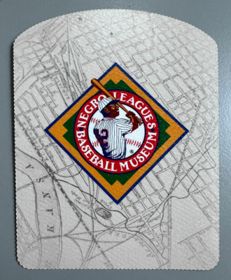
This was such a fun project to work on. The limited edition of spirits celebrate two of our country’s favorite pastimes: sipping fine spirits and enjoying the game of baseball.

Who isn’t ready for some spring weather and baseball?

If you aren’t familiar with the Negro Leagues Baseball Museum: In 1920, an organized league structure was formed under the guidance of Andrew “Rube” Foster—a former player, manager, and owner for the Chicago American Giants. In a meeting held at the Paseo YMCA in Kansas City, Mo., Foster, and a few other Midwestern team owners joined to form the Negro National League.

Soon, rival leagues formed in Eastern and Southern states, bringing the thrills and innovative play of black baseball to major urban centers and rural country sides in the U.S., Canada, and Latin America. The Leagues maintained a high level of professional skill and became centerpieces for economic development in many black communities.

The Lineup

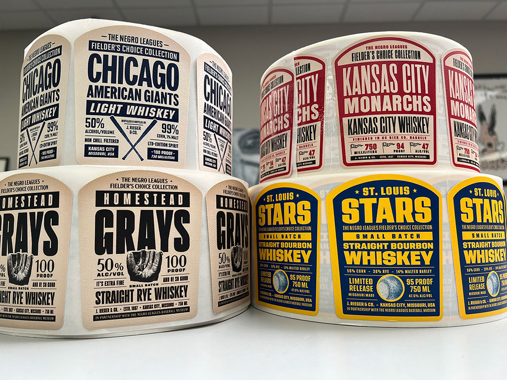
Each bottle features a retro label inspired by Negro Leagues teams with their logo on the inside of the label. All the spirits include Kansas City whiskey and three components that make that whiskey: bourbon, rye, and light corn whiskey.

J. Rieger in partnership with the Negro Leagues Baseball Museum releases Fielder's Choice

KANSAS CITY MONARCHS is a Kansas City whiskey finished in KC Bier Co barrels. Beer and baseball have always gone together, and these beer casks add a uniquely malty flavor to their whiskey.

HOMESTEAD GRAYS with a rye whiskey, like that of Pennsylvania’s traditional ryes, but this spirit has spice, with well-balanced and complex aromas and rich flavors.

LOUIS STARS is a limited-edition small batch straight bourbon whiskey. It is a variation of their classis bourbon distillation of corn, rye and malted barley, it’s rich, malty and buttery.

CHICAGO AMERICAN GIANTS is a limited-edition light corn whiskey that tastes like your favorite baseball snack Cracker Jacks! This delicious spirit delivers notes of popcorn, caramel, and peanut brittle.

A portion of the proceeds will benefit The Negro Leagues Baseball Museum, a true Kansas City treasure.

Need help getting your labels printed? Give us a call!

By Kat McDaniel, Principal at MEDiAHEAD

With our new equipment, we have the capabilities to print a wide range of embellishments and effects.

  • Hot Foil – this method of foiling can achieve finer and higher quality detail. Hot foil has a premium, luxurious effect to communicate quality.
  • Cold Foil – an alternative method of foiling that is more cost effective than hot foil due to lower set up costs.
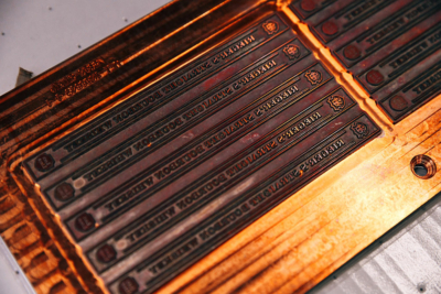
  • Emboss – an effect created by raising a design or image from the label surface to give it a tactile feel or highlight certain design elements or patterns.
  • Lamination – the entire label can be finished in either gloss or matt coating.
  • Metallic Ink – metallic inks are used to create a similar effect to foil, via the shine of the metallic particles found in the ink.
  • Specialty Inks:
    • Scratch n Sniff – a wide range of custom and stock scents.
    • Glitter – glitter infused coatings.
    • Black light – the effect is revealed under UV or black light.
    • Glow in the dark – used for security or novelty.

Why Embellishments?

Embellishment and Effects in LabelingLabel embellishments can help differentiate a brand from competitors.

Research has shown that when brands implement packaging that can involve 2 or more of the human senses, sales of that product go up. The goal of any package design is to a consumer to pick up a product, turn it over in their hands, and to promote positive feelings. An effective package is creative, looks great on the shelf, and effectively communicates to a consumer in under 7 seconds.

Our team has extensive expertise in all things related to labels. We would love to meet with you to discuss your needs, share our knowledge and develop a solution designed specially for you! Please give us a call.

By Kat McDaniel, Principal at MEDiAHEAD

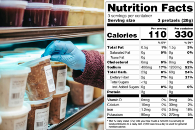
Deceptive Labeling: Food for ThoughtSince we entered the packaging and labeling industry, I have been fascinated and horrified by deceptive labeling on popular products that I see every day in the grocery store.

If you peruse any aisle, you will see all kinds of food labels touting products as being “healthy choices.” Cholesterol-free, gluten-free, natural, whole-grain and non-GMO, my favorite – no added sugar are just a few examples.

But is it actually healthier?

Many consumers believe these claims mean the food they are purchasing is healthier for them and their family. When what it really means is the companies advertising these products are taking advantage of the lack of understanding of the public to increase their profit.

“The supermarket is full of misleading food marketing, all of which is aimed at unsuspecting customers who simply want to purchase healthy foods for their family,” according to the US Food and Drug Administration. “Unfortunately, consumers don’t always have a good understanding of the verbiage used on the labels.”

The term NATURAL is another one that stands out to consumers.

Deceptive Labeling: Food for ThoughtCurrently, there is no official definition of natural. Consumers may pay more for the product with the natural label claim even though it is no different from the product next to it without the natural label claim.

Although there is an FDA front-of-package labeling initiative to combat misleading food-marketing practices, it will take years and possibly even decades to overcome all the inappropriate and misleading claims.

Educate yourself, learn about ingredients and read the ingredients on every package. I’ve been following Bobby Parrish, who has some excellent tips to help you correctly read labels at the grocery store!

You can find him on Facebook or @bobbyparish on Instgram.

By Kat McDaniel, Principal at MEDiAHEAD

MEDiAHEAD: Can SleevingMEDiAHEAD works locally with craft beverage brand owners of all sizes. And we work in markets that include energy drink, craft beer, kombucha, coffee and cannabis-infused beverages.

Why should you use can sleeving instead of printing on cans?

Direct can printing can limit the color and design of your can, while sleeves provide a 360-degree high-resolution graphics coverage with a full-spectrum of colors, along with tactile finishes such as matte, gloss and foil treatments.

Because MEDiAHEAD is local for the Kansas City Metro, we can offer quicker turnaround times. Using a shrink sleeve can get your product to market in a fraction of the time required for a printed can – usually a few weeks instead of several months.

Can sleeves are printed on the inside of the film, providing protection against scratches and scuffs that can occur during production and transportation.

When bringing a product to market, can sleeves can be done for a much lower minimum. MOQs can be in the truckloads for printed cans, while sleeved cans can be ordered in quantities as low as 500, allowing you to test and respond to your market.

You will never have to discard a printed can because the can printing is obsolete. Sleeves can also be used to cover up existing printed cans on obsolete inventory, turning a loss into a money maker.

If you would like to talk about how we can help you with your can sleeving needs, please call us!

MEDiAHEAD: Can Sleeving MEDiAHEAD: Can Sleeving

By Nikkie Freeman, Fractional CMO at MEDiAHEAD

The craft spirits industry is growing in the United States, with some 2,300 small distillers making their mark in the industry. In such a competitive environment, creating an eye-catching label is essential to making these craft spirits stand out from the crowd. Not only does it help distinguish one craft spirit from another, but it also influences consumers’ decisions.

In this blog post, we’ll explore why high-quality labels are essential to distillery success and discuss ways to make your label shine among the competition.

Why Attractive Labels are Essential for Distillers
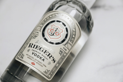
From Bottle to Brand: The Impact of High-Quality Labels in DistilleriesA visually appealing label design is important for distilleries because it is a crowded market, with smaller players dominating the market. In order to get your brand noticed among the other bottles on the shelf, it is crucial to have an attention-grabbing label design.

Packaging not only distinguishes one artisanal spirit from another but also influences consumer buying behavior. Research shows that 90% of consumers examine packaging before making a purchase decision, and 75% of purchase decisions are made at the point of sale in the beverage industry.

Labels visually communicate what your brand represents. A poorly designed and cheaply made label sets an expectation that the product is also low-quality. If you’ve poured your heart and soul into crafting the perfectly aged spirit, your label deserves the design and quality to communicate just how special and luxurious it is.

How to Make Your Label Shine Among the Competition
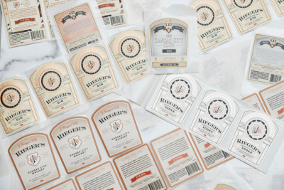
From Bottle to Brand: The Impact of High-Quality Labels in DistilleriesThere are a variety of ways to embellish your labels so that they reflect the quality of your whiskey, bourbon, rum, gin or other spirit.

Foil stamping – Hot stamping uses heat and pressure to infuse product labels with real foil imprints, giving them a premium appearance that will help your products stand out on the shelves.

Embossing – By incorporating a raised design into your product packaging, you’ll create an eye-catching appearance that’s sure to draw attention. Plus, the texture is irresistible to touch, giving customers one more reason to engage with your products. To enhance the embossed effect even further, consider combining it with foil stamping for a three-dimensional effect.

Variable printing – Variable data printing empowers brands of all sizes to explore a world of design possibilities and drive engagement like never before. With variable data printing, you can change specific elements of your design, such as graphics and text.

Unique materials – Combine any of the above options with a wide selection of materials, and you’re sure to get a label that is unique as your spirit. Choose from clear or white polypropylene films and smooth or textured papers.

Why Labels are Important for Brand Integrity
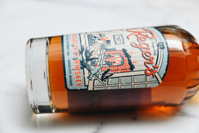
From Bottle to Brand: The Impact of High-Quality Labels in DistilleriesAge, refrigeration, handling and other environmental factors can start to degrade a label – whether it’s the ink fading or getting scratched up or the adhesive failing and coming off the bottle.

In order to protect the integrity of your brand, you need high-quality labels made with durable materials with adhesives that will hold up under a variety of environmental exposures. You’ll want to ensure your label continues to look great from the production line, to the store shelf, to the consumer.

How Labels Play an Integral Role in Your Production

Distilleries operate on tight deadlines, and the last thing you want is to hold up your production process because of a late delivery of labels. A reliable printing partner will work within your timeline to ensure that labels are delivered with ample time to spare.

Summary

Crafting a visually appealing label for craft spirits can be daunting, but it is crucial in order to stand out from the competition. Specialty finishes can elevate label designs, while the quality of materials and appropriate adhesives are essential for protecting your brand.
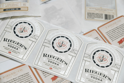
From Bottle to Brand: The Impact of High-Quality Labels in DistilleriesTimely delivery is another important consideration, and holding up production to wait on labels can have damaging repercussions. Working with a reliable partner who understands the unique needs of distillers can help circumvent these issues.

MEDiAHEAD has over 25 years of experience in specialty printing and offers high-quality products with on-time delivery. We take great pride in providing excellent customer service and helping your brand shine.

If you’re ready to create an unforgettable label for your craft spirits, let us help you get started! Contact us today to learn more about our capabilities.
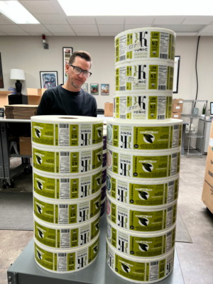
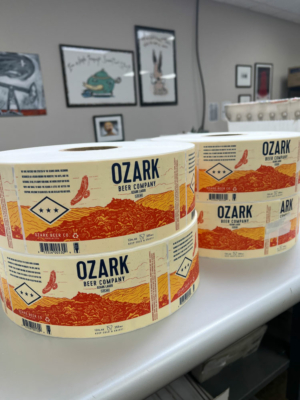
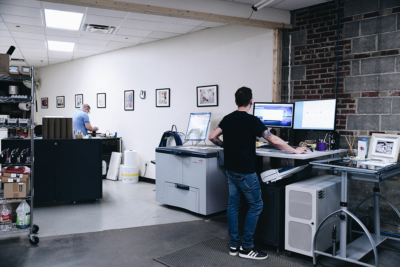
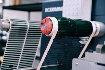
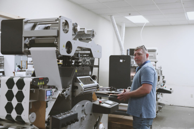
HP 6800, 7-color digital packaging pressReady to take your brand to the next level? Our new HP 6800, 7-color digital packaging press has the most versatile finisher on the market. Our state-of-the-art technology can perform multiple finishing processes in one run, allowing you to receive high-end labels without the high cost associated with complex setups.

Our “Rolls Royce” of label and packaging solutions produces a wide array of premium finishes like foil stamping, embossing, shrink films for packaging and beverages, and die-cutting. Even fine lines and detailed elements come off the press beautifully.

Our eye-catching packaging and labels will help your brand stand out in a crowded market and leave a lasting impression. Our team of experts will work with you to create a label that is tailored to your brand’s unique identity and messaging.

HP 6800, 7-color digital packaging press HP 6800, 7-color digital packaging press HP 6800, 7-color digital packaging press

BECAUSE WE’RE LOCAL your high-quality labels are delivered on-time, so you don’t have to worry about delays in your process.

HP 6800, 7-color digital packaging pressOur labels are not only visually stunning, but they are also durable and functional. We use high-quality materials that can withstand various environmental conditions, ensuring that your label stays looking great from production to consumption. Plus, our quick turnaround times guarantee smooth production processes – no delays or waiting around for shipments. We are local, so you can even come and watch them run or press okay the batch.

Our goal is to provide you with a premium label solution that will help you increase brand awareness, drive sales, and ultimately grow their business.

Our labels are an investment in your brand’s success, and we are confident that our product will exceed your expectations.

Time for an upgrade? Give Kat a call at 816.621.2451.

HP 6800, 7-color digital packaging press HP 6800, 7-color digital packaging press HP 6800, 7-color digital packaging press

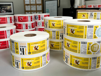
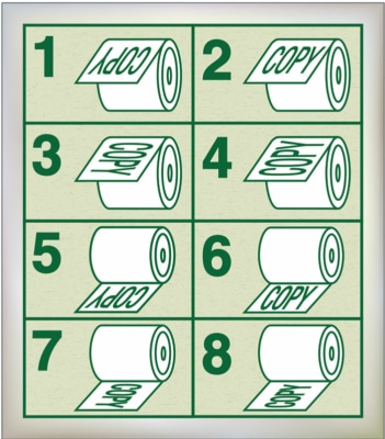
When you order labels, you will be asked about unwind directions by your printer. Unless it’s accurately identified, we could easily print labels that didn’t fit correctly on your products or the machines applying them.

(If you are just hand applying labels to your package or product, then the unwind directions are not important. This usually applies to labels that are smaller quantities and not machine applied.)

With machine labeled product – this is critical! They MUST be properly aligned.

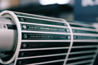
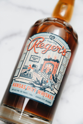
Let’s look at an example using the J Rieger bottles.

Unwind InstructionsWe need to consider the shape and orientation of the glass bottle to which the label will be applied. Because they apply their labels with a machine – the container and the roll of labels need to meet up in the correct way, so that the label gets applied perfectly every time.

The machines typically roll the labels onto the surface, rotating the bottle as this happens. The roll needs to be aligned so that the leading edge of the product label comes off the roll with the height oriented – otherwise the label would be applied lying down, instead of standing up!

Keep in mind that labels are like print – the first measurement is always the width of the label and the send refers to the height.

I know this all sounds ridiculously complicated, but no worries – we’re here to help you every step of the way!

Need help with your next label project? Give us a call!